Let's not be boring
At a Glance
My contribution: Brand identity design for a 2021 streetwear label, including the wordmark, standalone icon, color system, typography, lockups, and usage manual.
Challenge: Give a product category with similar garments a recognizable brand asset that could work both inside the name and on its own.
Outcome: The “o” became a surprised face that anchors a flexible identity across achromatic and color versions, horizontal and stacked marks, and apparel applications.
On a shelf with Grizzly, Volcom, and Pace
Luiz Henrique brought me Unboring on January 29, 2021: a streetwear label for the alternative crowd, people into fashion, and skaters. The brief described it as a brand ready to challenge the status quo.
The difference began before the fabric
The category left little room to distinguish one T-shirt or bag from another before purchase. Luiz wanted the brand itself to become the differentiator, with Supreme named as the reference. The brief also asked for a standalone icon, like the cupcake and bones used by Johnny Cupcakes.
The three references Luiz sent were wordmarks. In two of them, the letterforms also created an image; VANS extended its “V” over the letters that followed. This pointed toward finding the icon inside “Unboring” itself.
Making “o” unboring
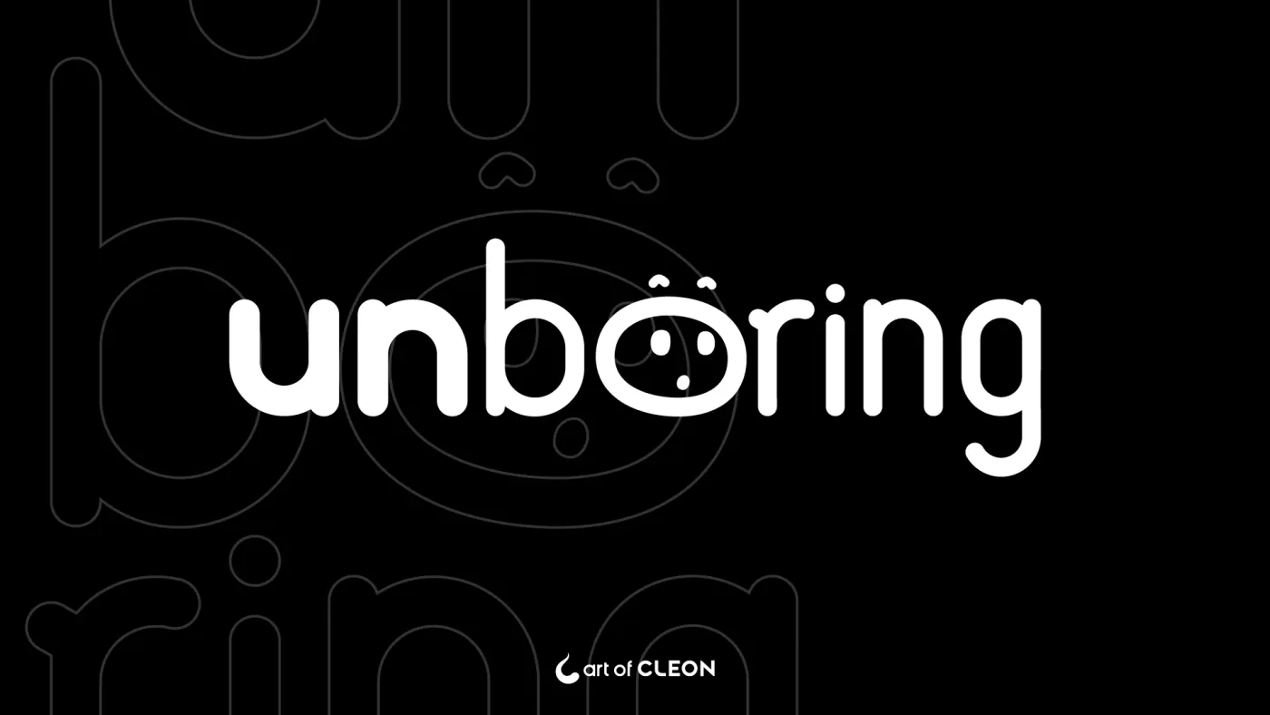
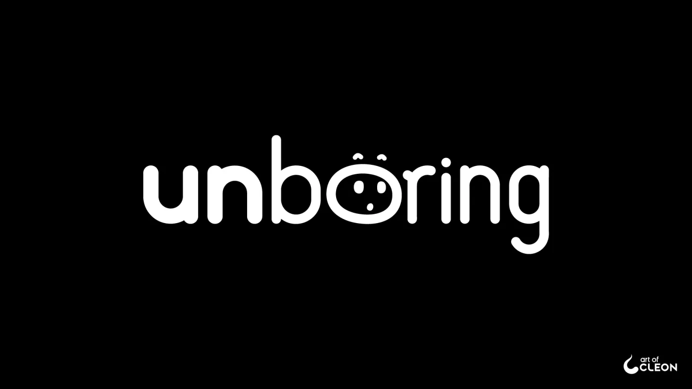
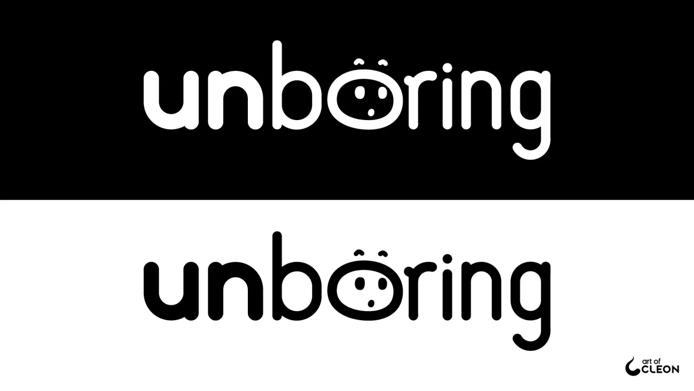
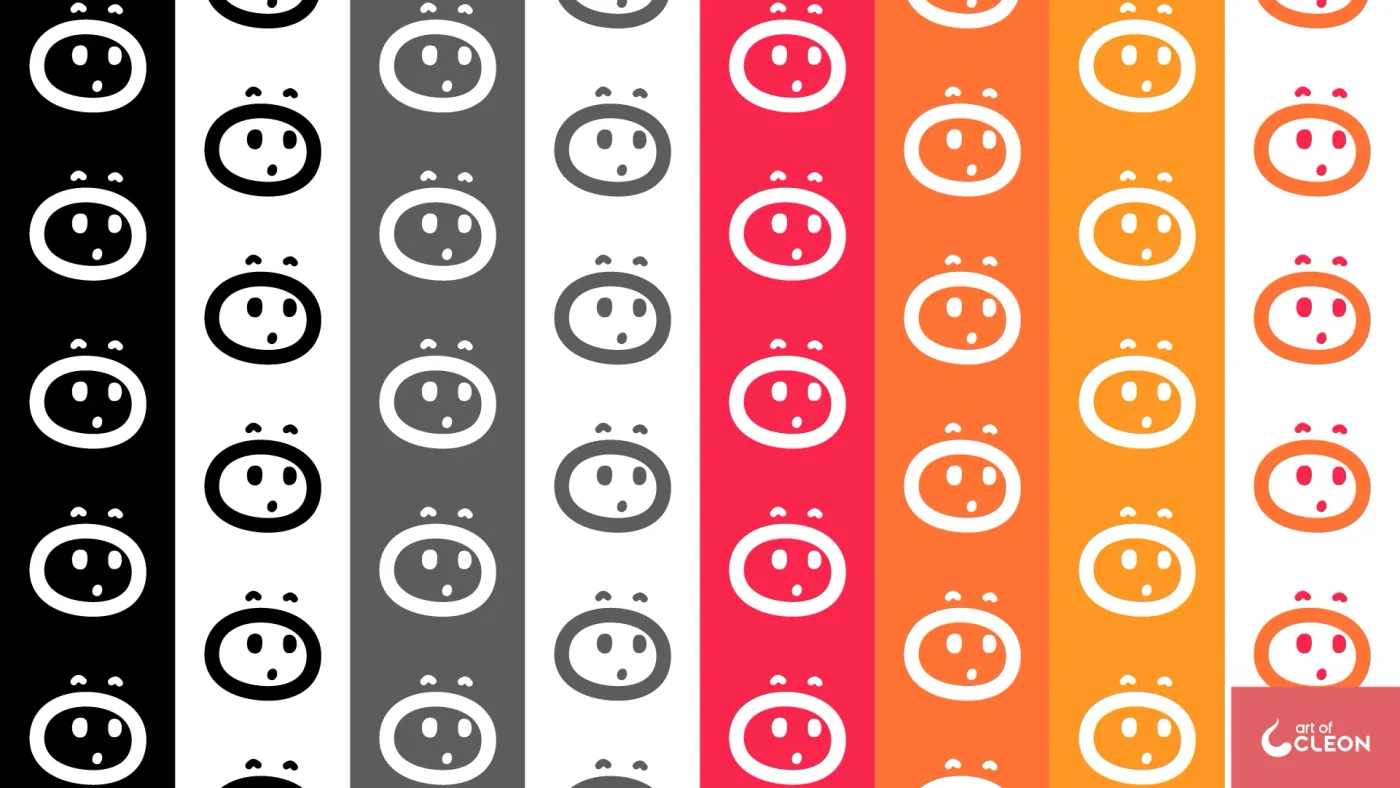
I drew the “o” as a surprised face that remains legible inside the wordmark and can also be used on its own.
Raised brows, two eyes, and a small open mouth made the expression immediate. The surrounding letters had to accommodate that expression without losing the name’s readability.
“Un” is bold, “bo” shifts to a lighter weight, and “ring” closes condensed. The changes in weight and width break the even rhythm of a lowercase word and make the face its focal point.
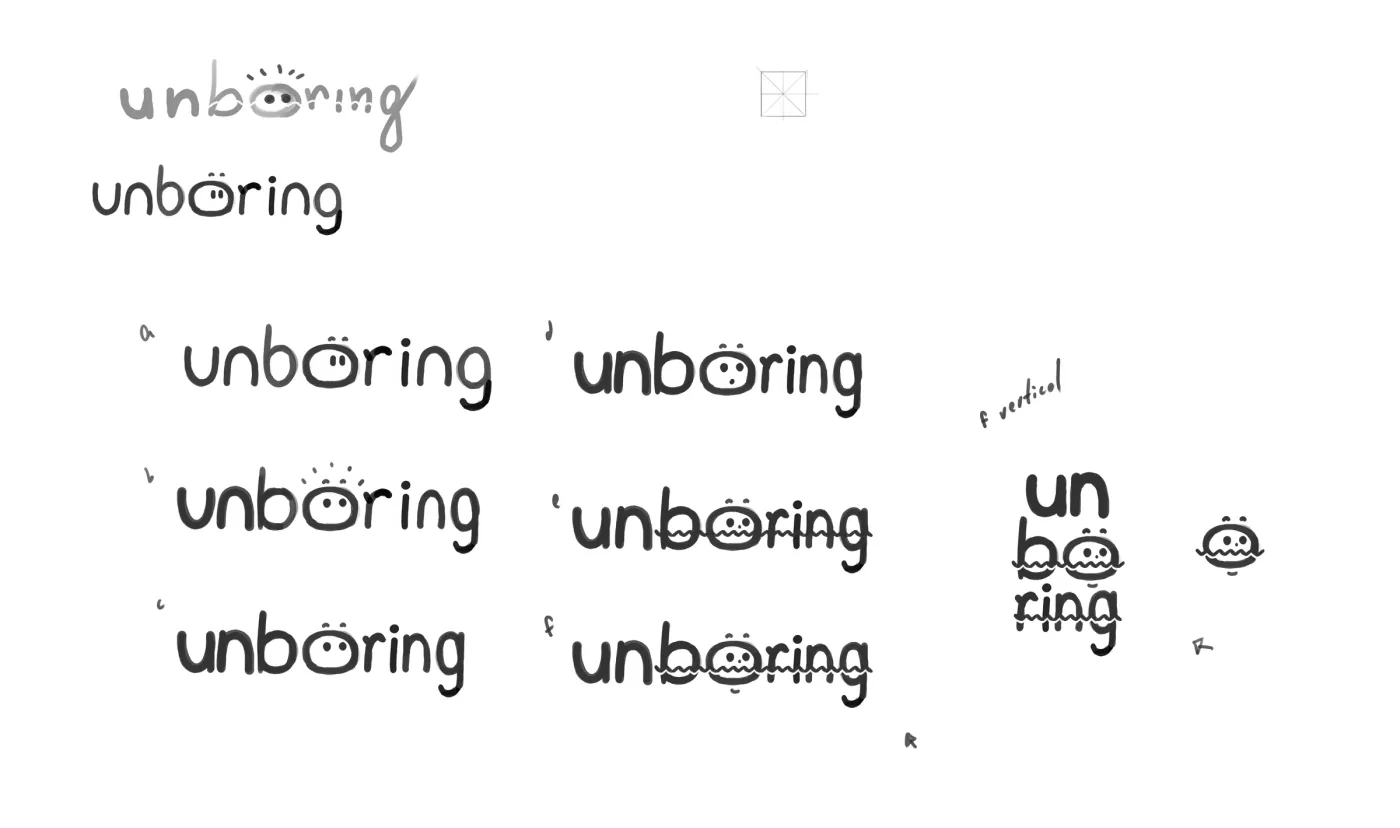
The “o” was a face from the first sketches. I also tested a wavy stroke through “boring,” but it made the mark too busy in application, so I followed another direction.
Black first, then three colors
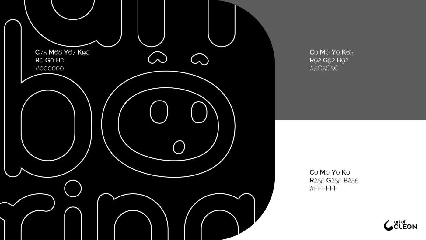
The brief called for sober tones. I fixed the main palette at black, charcoal gray, and white.
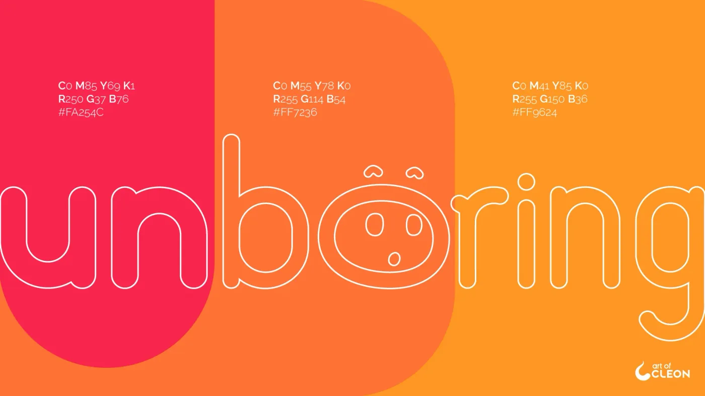
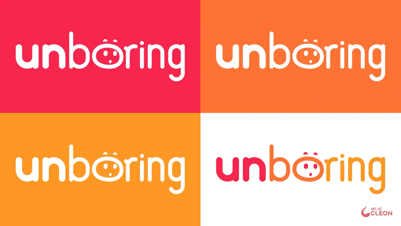
The alternate version divides the word into three color blocks: “un” in #FA254C, “bo” in #FF7236, and “ring” in #FF9624. It was approved alongside the achromatic mark for applications that could carry color.
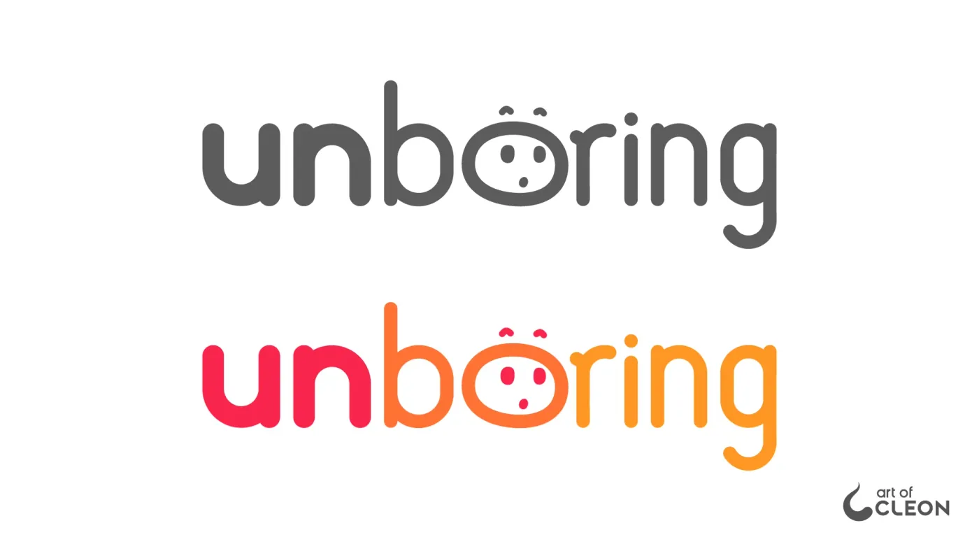
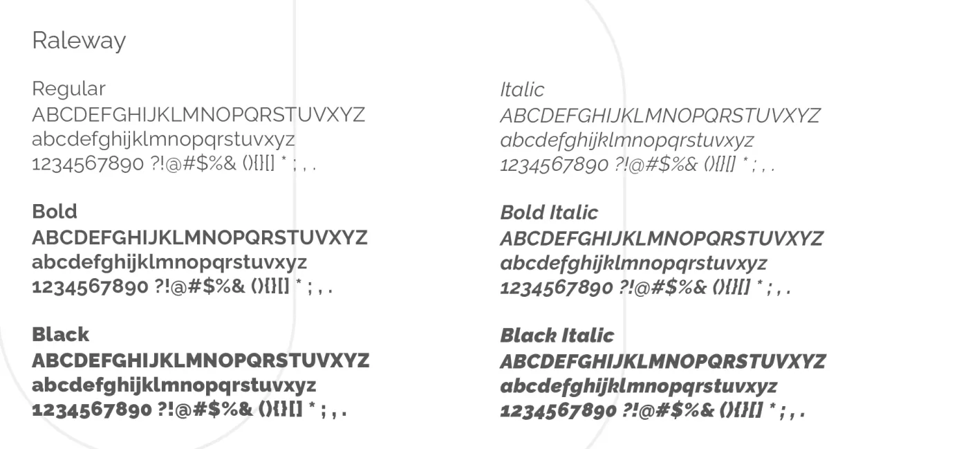
Raleway became the brand typeface in regular, bold, and black, with matching italics. I delivered horizontal, stacked, and standalone versions of the mark in black, gray, white, and color. The manual documents construction, clear space, palette, and type use.
Luiz designed the shirts
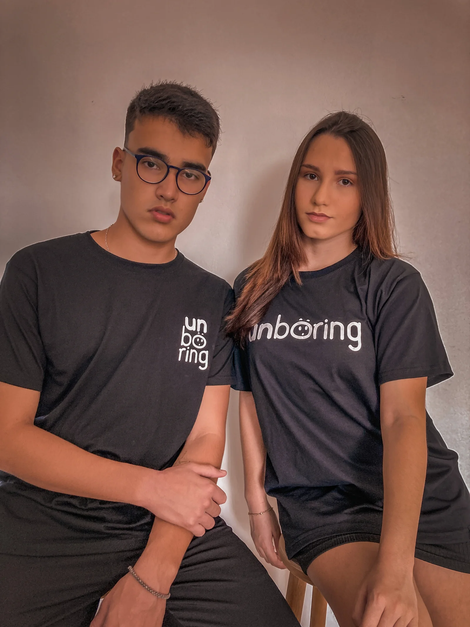
Luiz designed the T-shirts and applied the identity in three ways: the stacked mark on the chest, the horizontal wordmark across the front, and the face on its own. The photographs here document those applications.
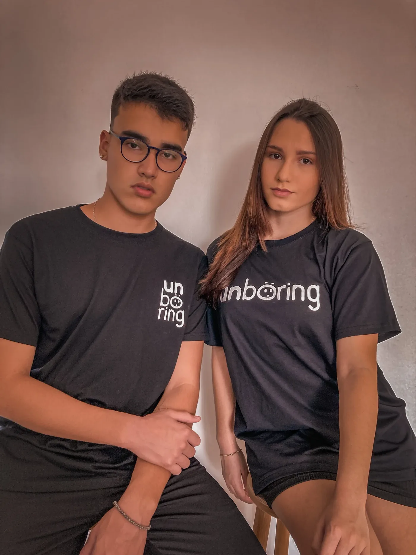
T-shirt design: Luiz Henrique. Photography: Unboring (@unboring.co). The stacked and horizontal lockups appear side by side.
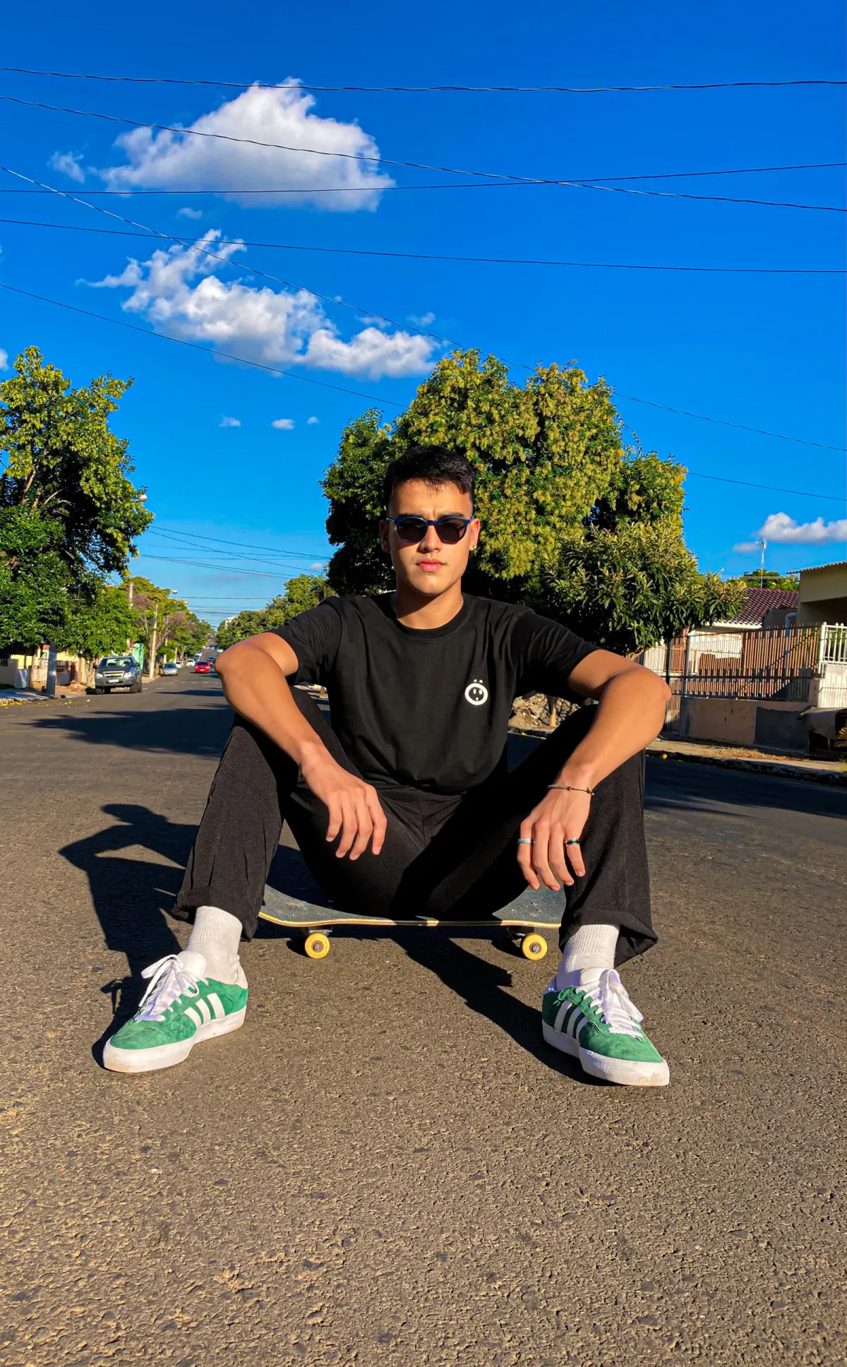
Luiz used the standalone face as a small left-chest emblem.
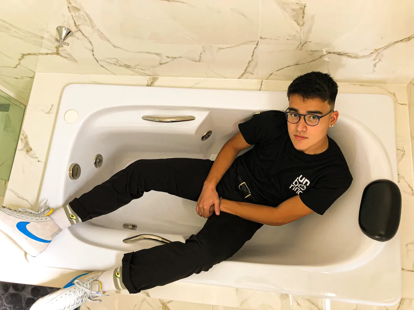
Luiz used the stacked lockup to keep the full name in a compact chest print.