From the bell curve to the people inside it
At a Glance
My contribution: Product design for Rating Overview, covering information architecture, data visualization, interaction states, responsive behavior, and prototyping.
Challenge: Make organization-wide performance readable while preserving a direct path to each employee.
Outcome: A reporting experience that connects distribution and a nine-box heatmap to filtered tables and individual detail without losing population context.
Two questions, one population
Rating Overview had to make organization-wide performance legible without turning the page into a roster. It answers two questions about the same people: how ratings are distributed, and where employees sit across performance and potential. The interface begins with totals, then reveals names only when they become useful.
A department filter updates Rating Distribution and Talent Heatmap together. The same population can then be read first by score and again by the relationship between performance and potential, without forcing the reader to reconstruct the context.
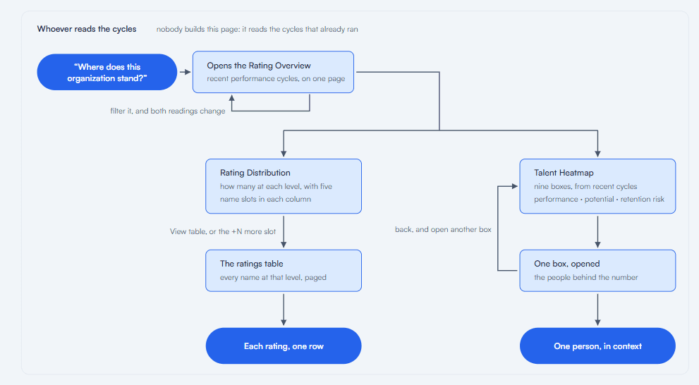
The same population can be read as a distribution or a heatmap; each branch ends at individual detail.
A distribution that knows its limit
The overview places five rating ranges under a bell curve, pairing each bar with a count and its share of participants. Names keep the aggregate tied to real employees, but each column holds only five slots. When there are more, the fifth becomes “+N more” and points to the table.
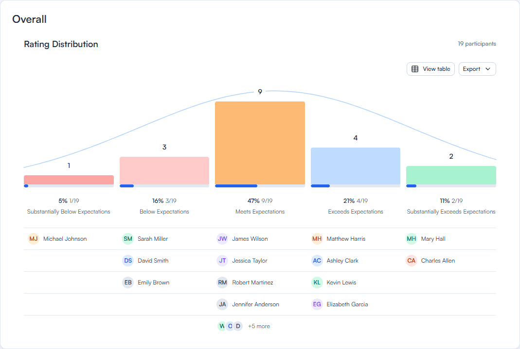
Five visible slots are enough to connect each range to people; the final slot becomes a route to the complete table when the list exceeds that limit.
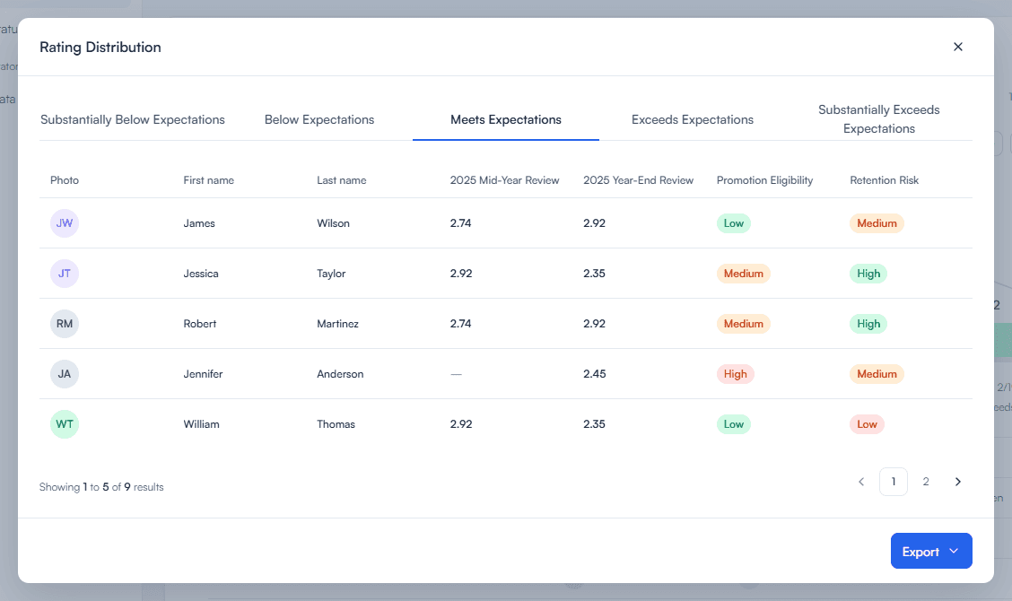
The table keeps every employee available by rating range, with scores shown row by row and pagination for longer lists.
Nine boxes before individual detail
The Talent Heatmap begins as a nine-box overview. Every cell combines a headcount with the composition of retention risk. Selecting one replaces the grid with that quadrant, plots its employees across the same two axes, and reveals an individual card on hover. The reader chooses when the report should stop being aggregate.
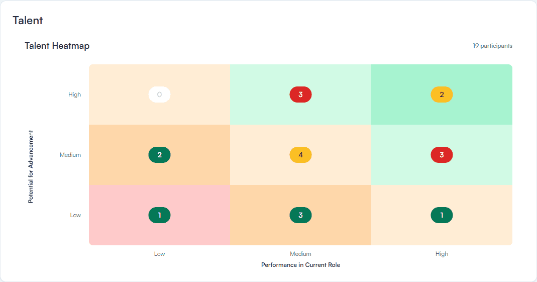
The first state keeps all nine quadrants comparable before any employee detail appears.
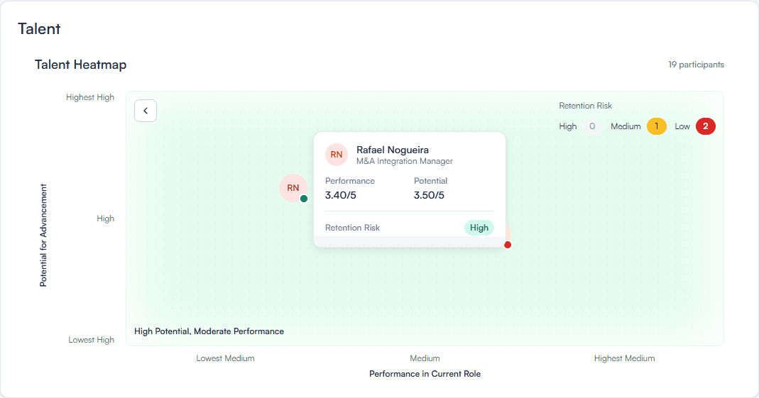
Opening a quadrant replaces totals with people. Retention-risk color remains as a secondary reading, while the hover card adds the individual’s scores and role.
A name search would give readers arriving with a specific employee in mind a direct route to that person. Filters are useful for comparing groups; search would remove the need to scan the heatmap first.
Explore the report
Filter the population, open the complete ratings table, and move from the nine-box overview to an individual employee.
viaPeople, its product, and the interfaces shown in this case belong to viaPeople. This portfolio presentation is a reconstruction based on the original designs, using fictional data to protect confidential information.