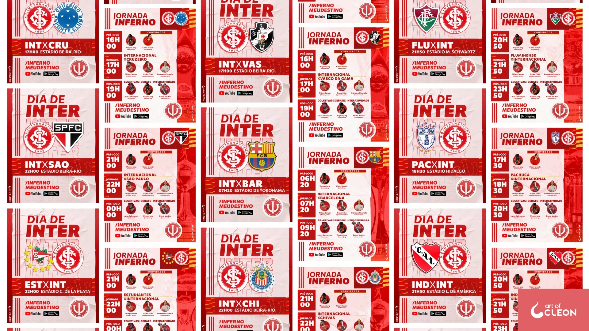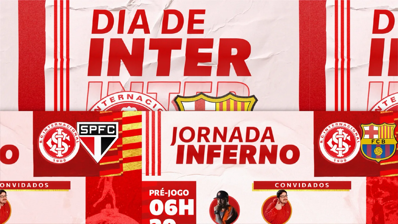
Every match has its build-up
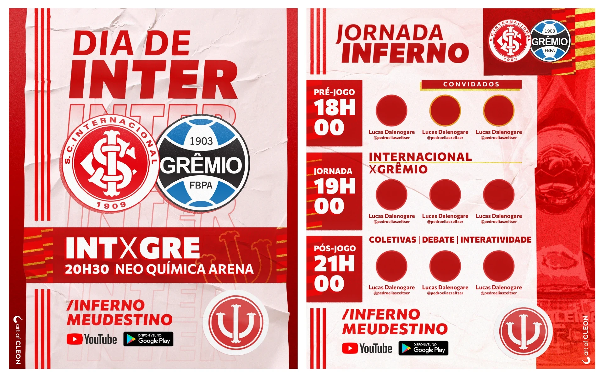
Match day, from the first post
Rádio Inferno covers Sport Club Internacional throughout the week, with a full broadcast schedule on match days. In 2021, I designed two editable social media templates: “Dia de Inter” to announce the fixture, and “Jornada Inferno” to present the coverage before, during and after the game.
Paper, red and a touch of gold
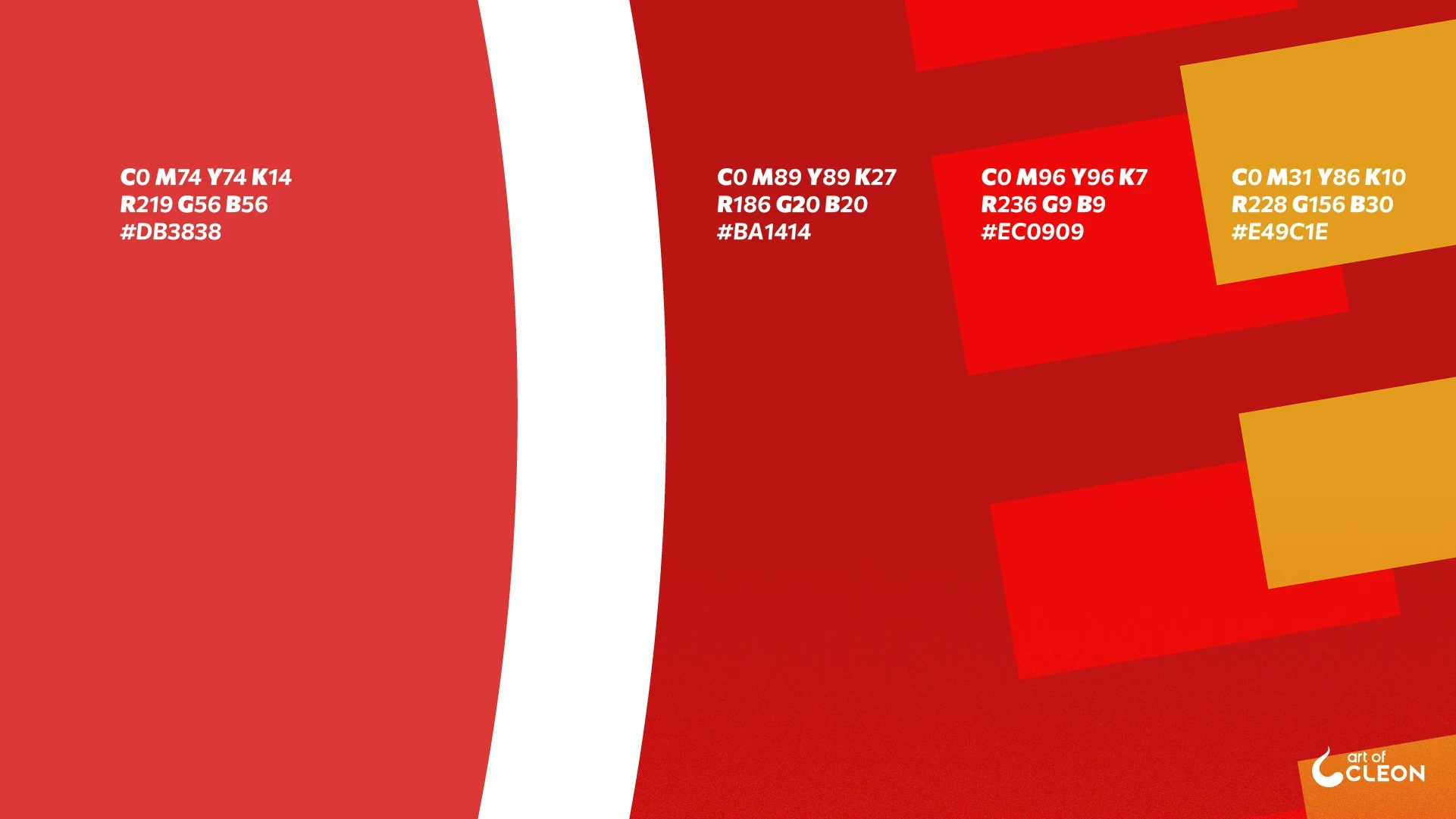
I took inspiration from posters pasted onto walls, combining creased paper and wall textures with Internacional’s red and white. Gold details add emphasis and break up the red-and-white palette.
The layout studies test the scale of the headline, the position of the club crests and the placement of match details. In the finished “Dia de Inter” card, the crests sit above a red strip containing the fixture, kickoff time and stadium.
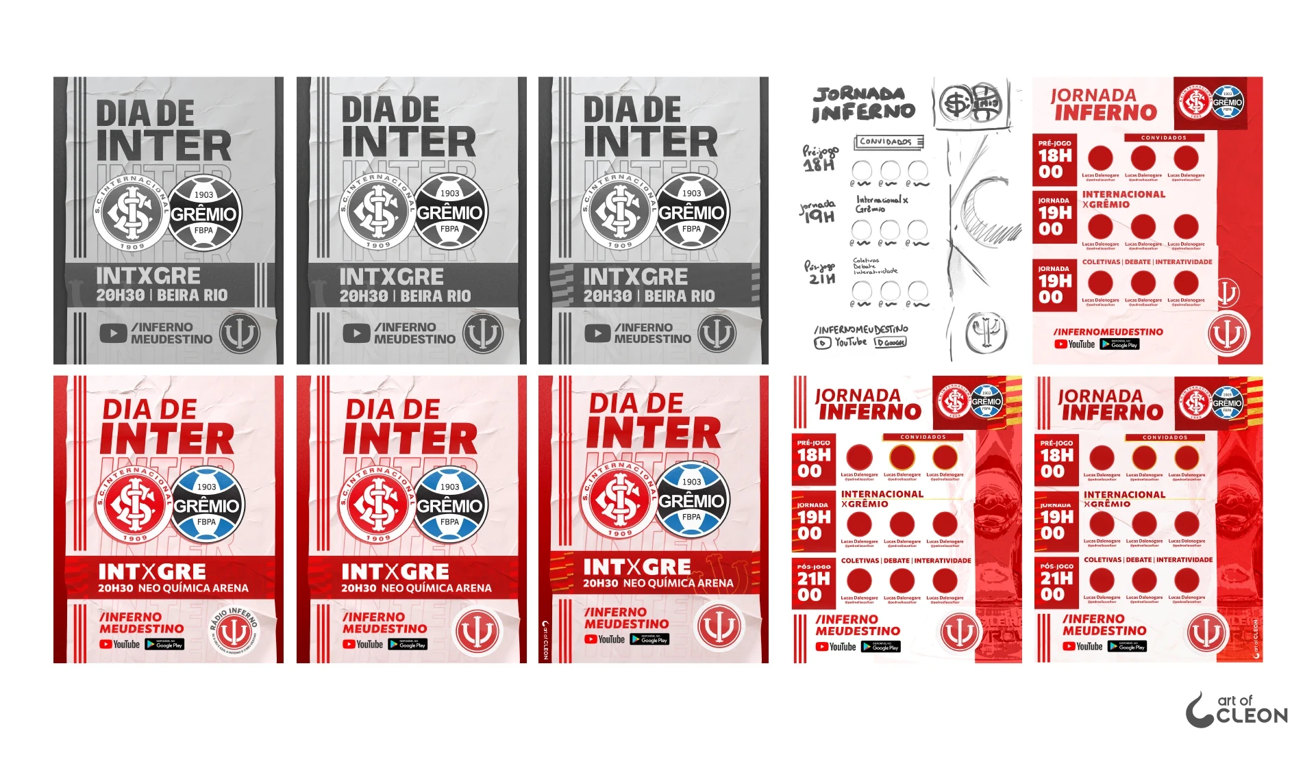
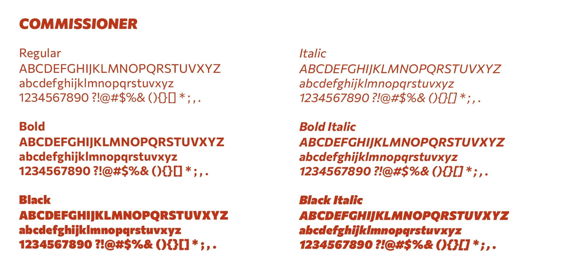
Commissioner provides the typography in regular, bold and black weights, with matching italics. Large, heavy lettering gives the program titles and match details prominence, while smaller text carries names and supporting information.
A schedule for the whole broadcast
“Jornada Inferno” follows the same visual treatment, with a schedule organized into pre-game, live commentary and post-game coverage. Guest portraits accompany each part of the schedule, which also lists the post-game activities: press conferences, discussion and audience participation. The trophy for the competition appears along the right side of the card.
Ready for the next fixture
I delivered the cards as editable Photoshop files so Inferno’s team could create new posts from the templates. I also prepared the trophy images in advance, making them easy to swap alongside club crests and participant photos.
For the presentation, I chose opponents Internacional had beaten on the way to winning major titles, bringing part of the club’s history into the examples.