The brand changed before the logo
At a Glance
My contribution: Creative direction and graphic design across the 2023 rebrand and 2024 logo redesign, including gradients, 3D assets, motion, and product lockups, in collaboration with Kore’s graphic design, UI/UX, and marketing teams.
Challenge: Turn a fragmented identity into a flexible system that could support the platform, product family, and later name change without discarding recognizable brand equity.
Outcome: The symbol’s existing hexagon became the foundation for a scalable identity spanning ten product marks, a library of more than 250 3D renders, websites, one-pagers, events, and motion.
The logo stayed while the brand moved
KoreConX, now KoreInside, is a fintech founded in Canada and now based in the United States. It runs an all-in-one platform for private capital markets. I worked there for five years and led its graphic design function for three of those years, in nonconsecutive periods. This case connects the 2023 rebrand with the 2024 logo redesign developed as the company shortened its name.
The 2023 identity had several parts working outside the same system. The icon used a blue we hadn’t registered in the design system. Work Sans became too expressive at heavier weights. The current primary blue made layouts read darker and more closed. Blobs and waves suggested fluidity, but restricted the compositions we could build around them.
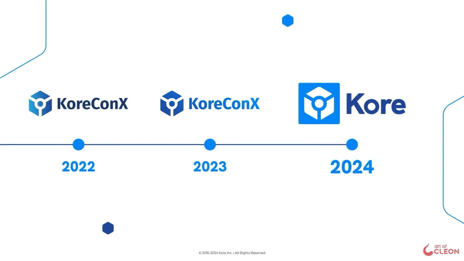
The 2023 system ran on the KoreConX name for about 18 months. The wordmark changed only when “ConX” was dropped in 2024.
The hexagon was already there
Instead of adding another motif, we expanded a shape already inside the symbol. The hexagon replaced the blobs across motifs and the icon set. Large hexagons anchored one corner of an image; smaller ones balanced the composition from another.
My colleague Valentina proposed Hanken Grotesk for titles, Lato for text, and B200 as the primary color. Together we added a new B300 and moved the previous dark blue to B350. I directed the rebrand and developed its gradients, characters, 3D library, and motion assets.
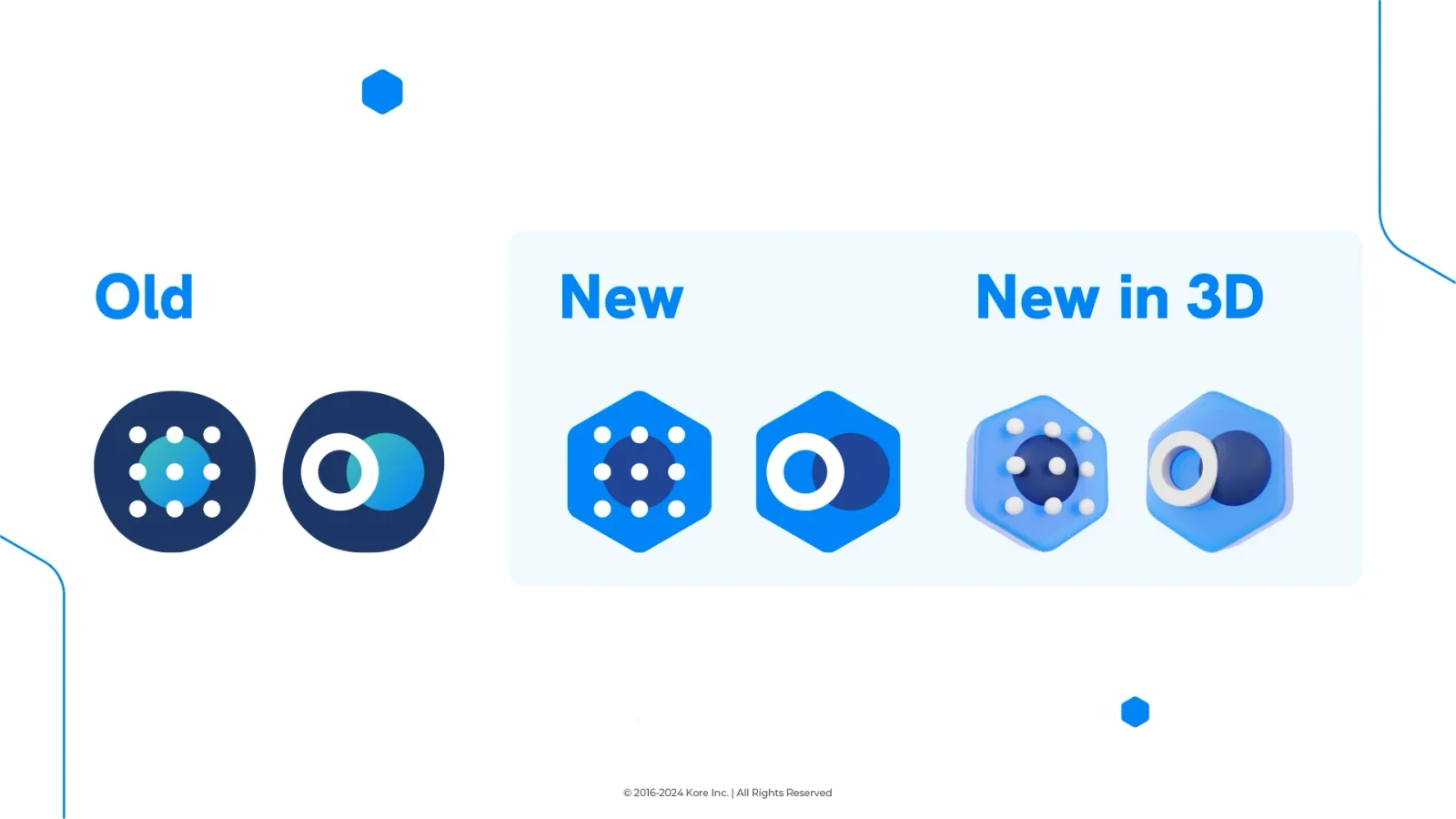
The flat and 3D icon sets carried the symbol’s hexagon into product communication.
The logo caught up a year later
When KoreConX became Kore, the wordmark still used Fira Sans, a typeface found nowhere else in the identity. I set the new wordmark in Hanken Grotesk, bringing the logo into the brand’s typographic system.
The symbol also needed a container for standalone use. Its negative space cuts away three vertices of the hexagon, making it look optically off-center. My first version used a circle, but the hexagon inside made that circle appear distorted. The next revision became a square. It held the icon in place and carried the product color while the white symbol stayed unchanged.
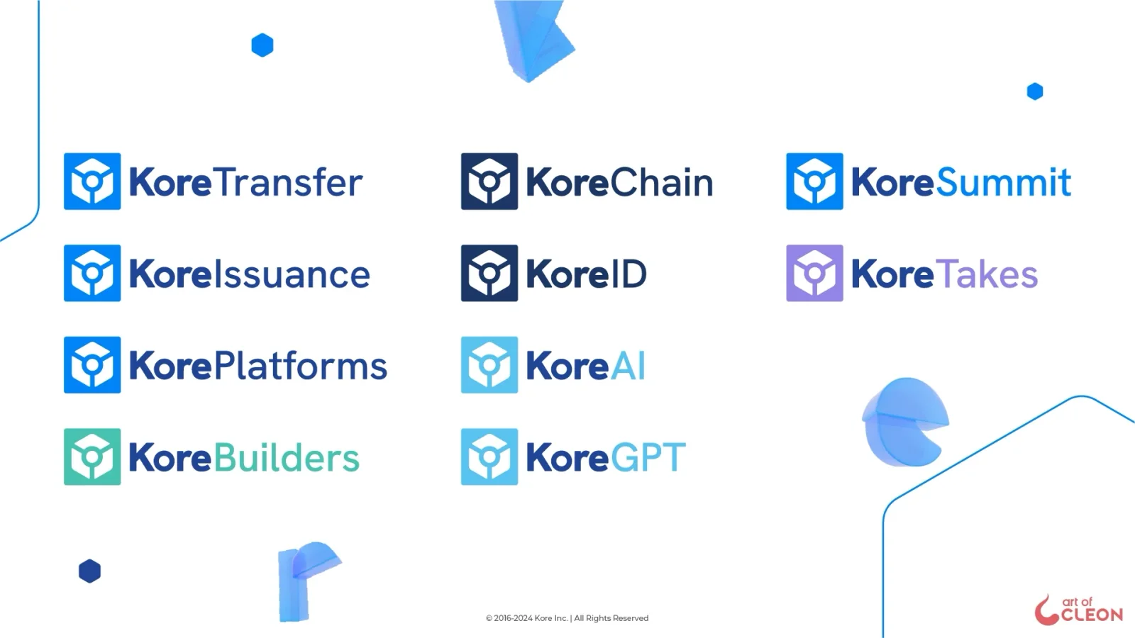
One square carries the color across ten product lockups while the symbol and wordmark construction stay fixed.
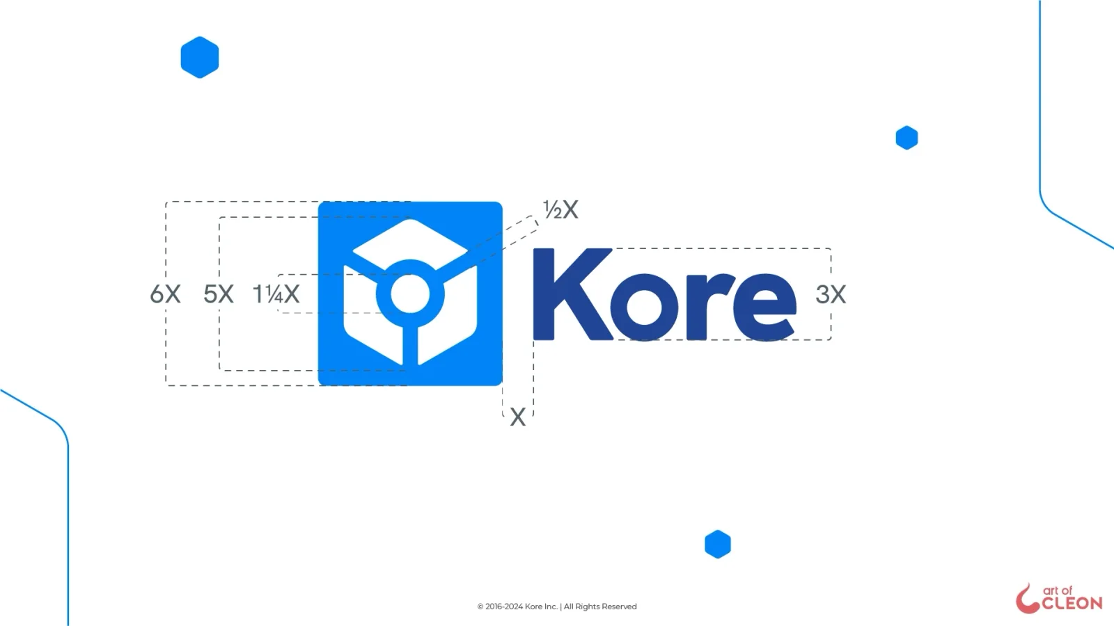
The final lockup uses the icon width as the unit for its spacing and proportions.
The reveal collapses KoreConX into the square before the new Kore wordmark appears.
The system kept changing in use
Three blues, five secondary colors, and six neutrals supported the system. Hanken Grotesk Black handled titles; Lato ran in Light on graphic pieces and Regular on the sites. I produced more than 250 3D renders from icons, objects, and the angles each piece required. We exported site animations as vector JSON instead of GIF to reduce file weight and preserve their quality at different sizes.
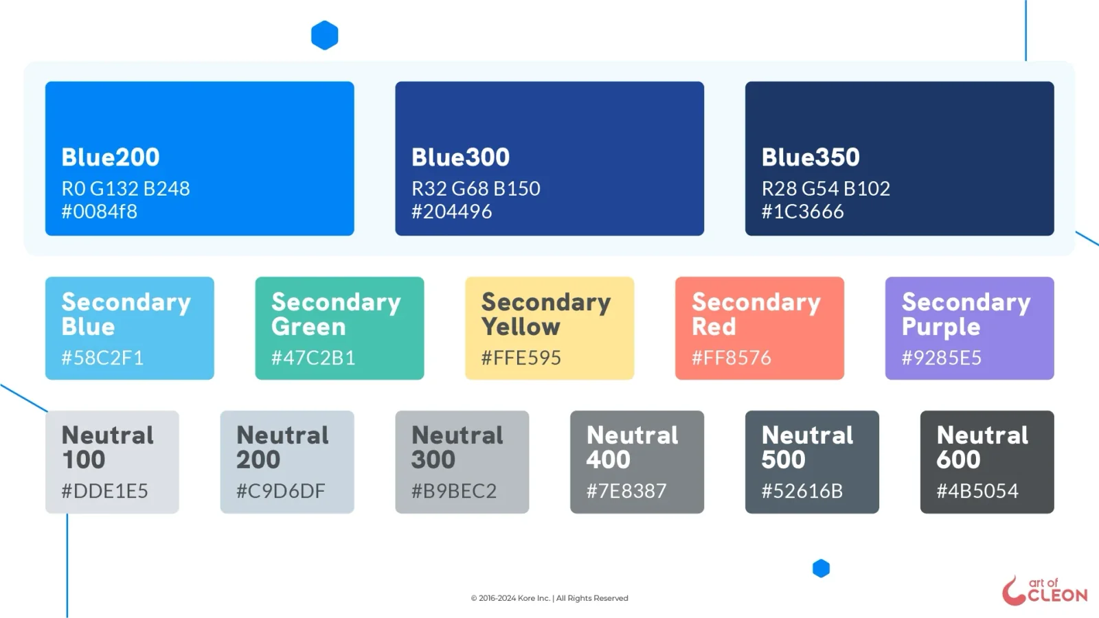
B200 became the primary color, a new B300 entered the scale, and the former primary moved to B350.
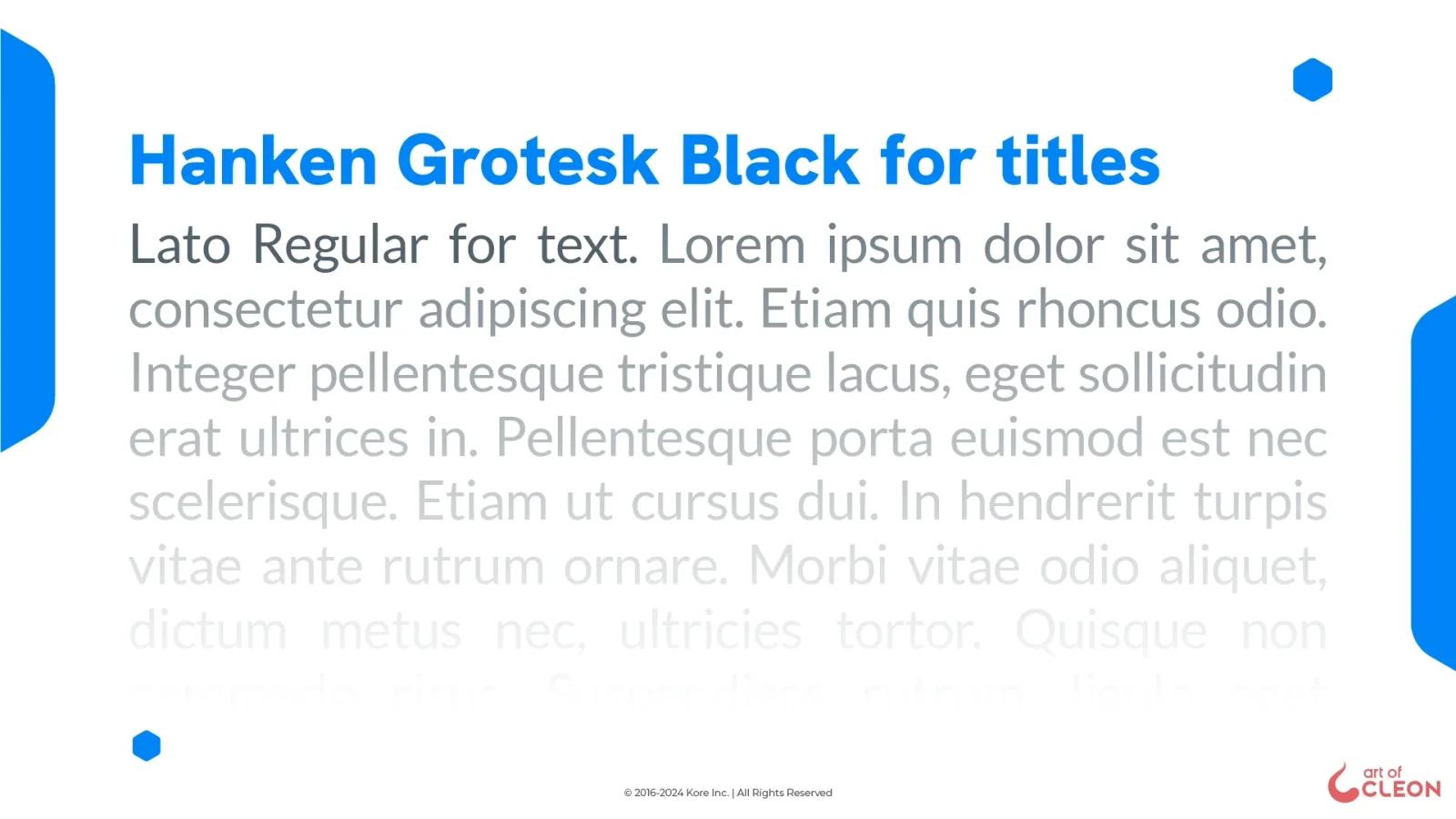
Valentina proposed Hanken Grotesk for titles and Lato for text; the wordmark joined that pairing in 2024.
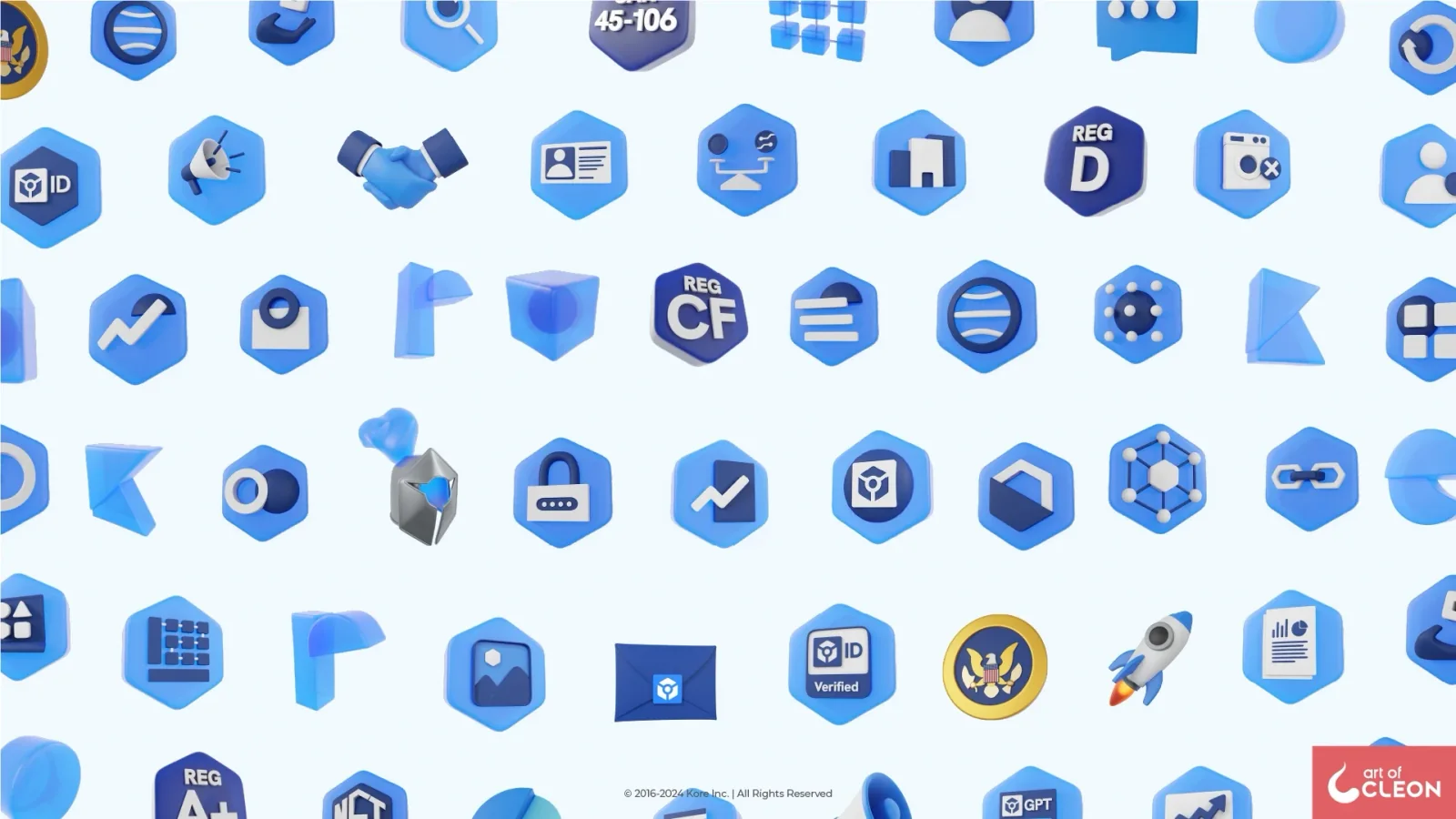
A sample of the 250-plus 3D renders I produced, including regulatory seals used throughout the company’s material.
Use changed two details. Lato Light on Neutral 500 was too weak against white, so body text moved to Neutral 600. Small artifacts in the Blender renders inflated file sizes, so I revised the export process. KoreChain remained an exception, keeping Work Sans, Lato, and B350 to stay separate from the main platform.
The system reached the sites
Gabriel, the UI/UX designer on the web side, created the page structures and adapted text and button components from the product design system. He also introduced a baby blue for the sections. The graphic team supplied illustration, 3D, and motion; Gabriel and I worked together to define what each page needed.
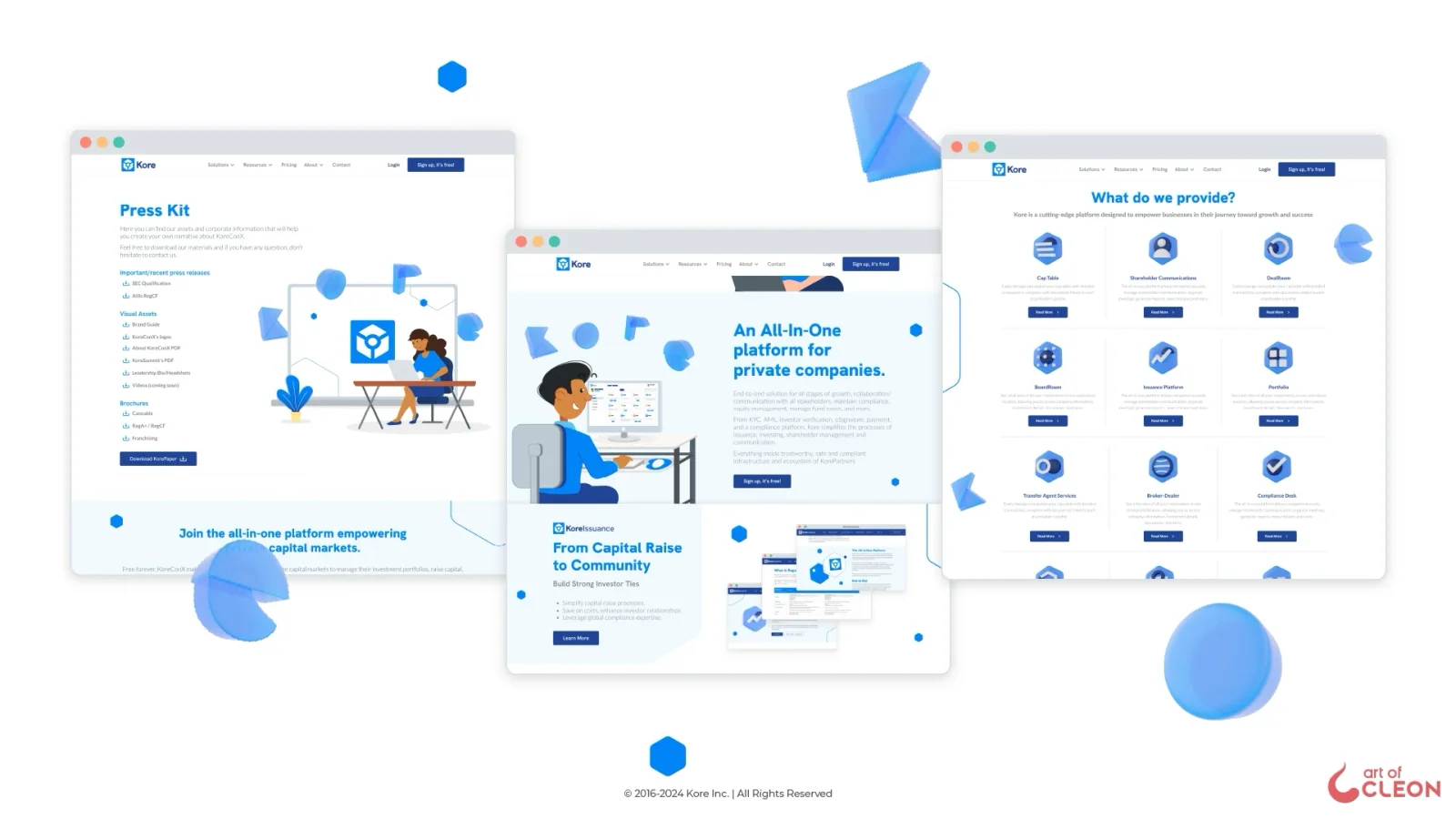
Gabriel structured the pages. The graphic team produced the illustration, 3D, and motion around them.
Three motions for the main site: a compliance hero, a map of shareholder workflows, and a sequence of transfer-agent tools.
KoreChain builds a line-based blockchain scene; KoreBuilders assembles pages around its API infrastructure; KoreTransfer arranges solution cards around the product mark.
Beyond the sites, the identity ran through brochures, one-pagers, social media, and more than twenty KoreSummits and webinars.
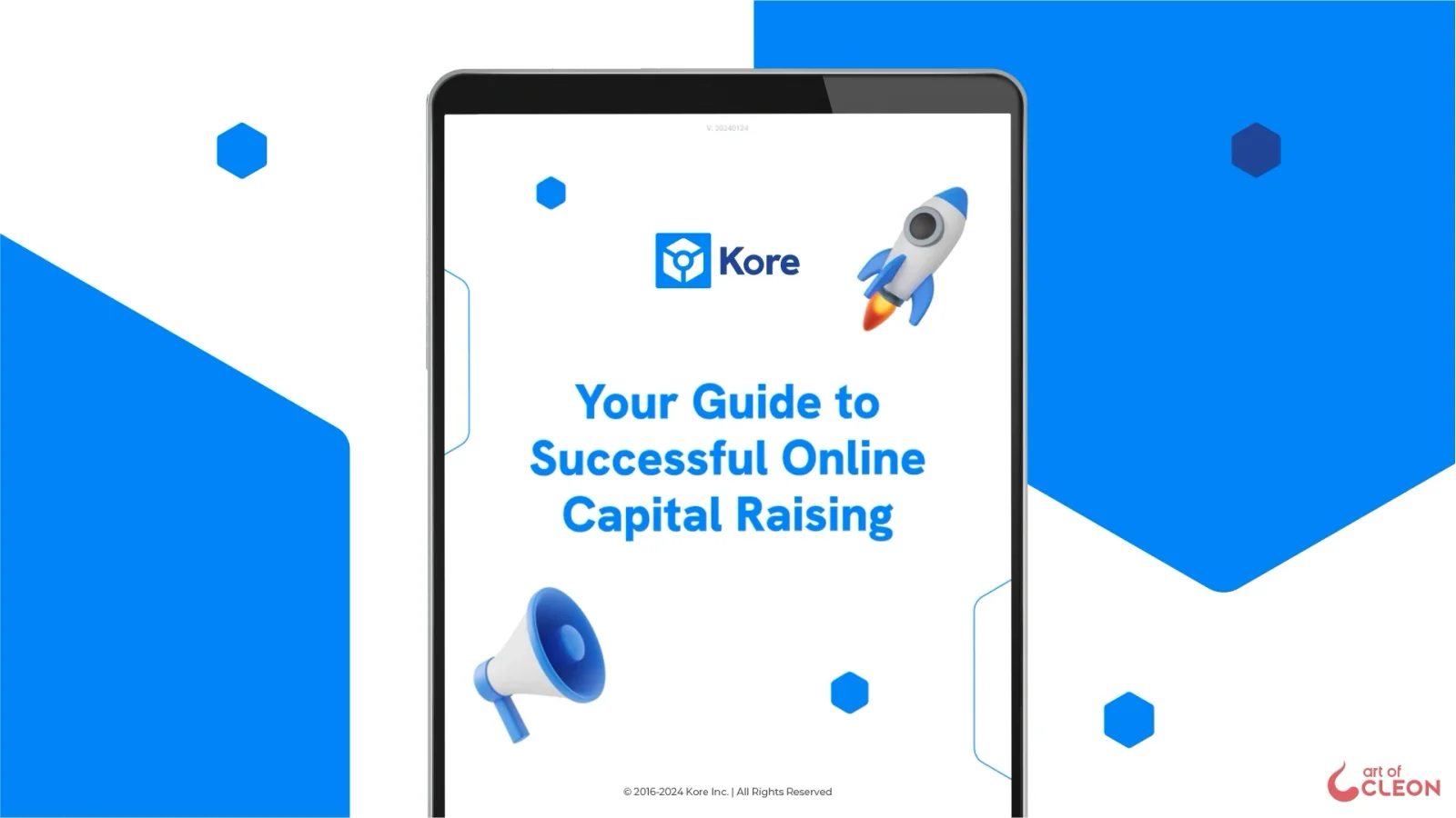
Brochures and one-pagers about regulation were where the system did most of its everyday work.
The name changed. The system held.
The 2023 system had supported KoreConX for about a year and a half when the brand name was shortened in 2024. It didn’t need replacing, but the files did: the wordmark, icons carrying the previous symbol, 3D letters from “K”, “C”, and “X” to “K”, “o”, “r”, and “e”, and active brochures, decks, and social assets.
The rebrand also gave the team another way to produce campaign imagery. Before it, each piece required a new illustration or the reuse of an earlier one. Photography entered the system, so production no longer had to wait for illustration.
Work produced for Kore Inc. All rights to the brand and its assets remain with Kore. The identity shown here ran under the KoreConX and Kore names in 2023 and 2024; the company now operates as KoreInside.