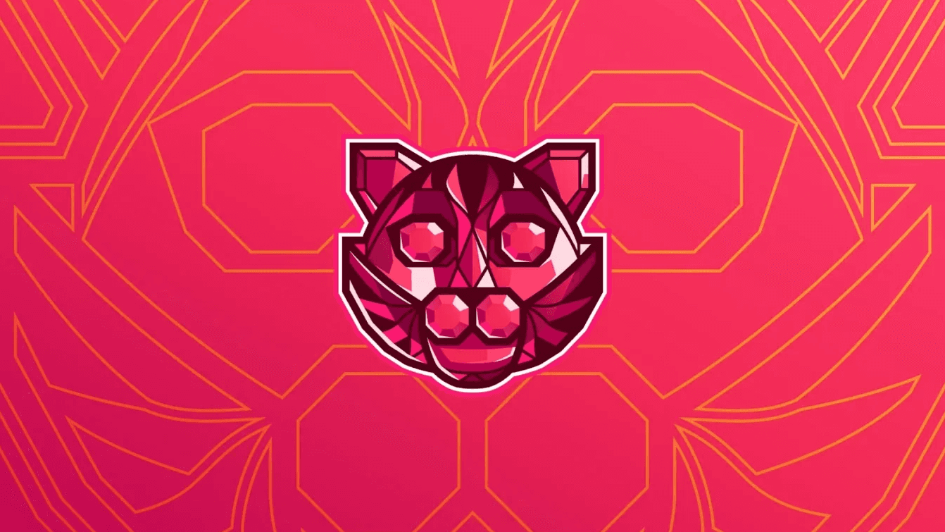
A gem-cut cat built to move
At a Glance
My contribution: symbol design, branding applications and motion design for the refreshed identity.
Challenge: keep the connection to Rubi, Nathalia Miolo’s cat, while making the mark recognizable at the small sizes common to tournament interfaces.
Outcome: a compact cat symbol built from ruby-like facets, with Ruby as the primary family, Cosmos as the secondary family, Gold as an accent and a launch animation for social media and the broader brand presentation.
A Cat, a Gem and a Small Canvas
Equipe Rubi organized Teamfight Tactics tournaments. Its identity already revolved around Nathalia Miolo’s cat, Rubi. Nathalia created the lettering, while my work focused on redesigning the symbol, extending it into branding applications and bringing the refreshed identity into motion. The existing illustration carried more detail than the smallest applications could hold.
The redesign had to preserve two ideas at once: the warmth of a mascot and the faceted geometry of a ruby. The brief pointed toward a cat face made from angular planes, with enough personality to remain distinctive after the silhouette was simplified.
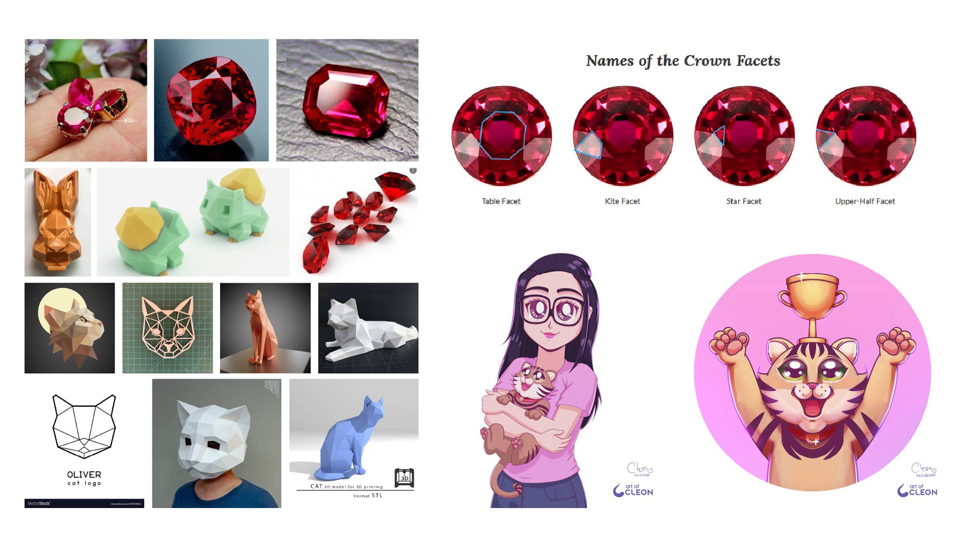
The visual territory came from the overlap between the cat, the ruby and the scale of the final applications.
Less Detail, More Recognition
The process reduced the character to its face, then rebuilt the expression with angular planes. Ears, eyes, muzzle and ruby facets had to read as one shape, instead of competing layers of illustration.
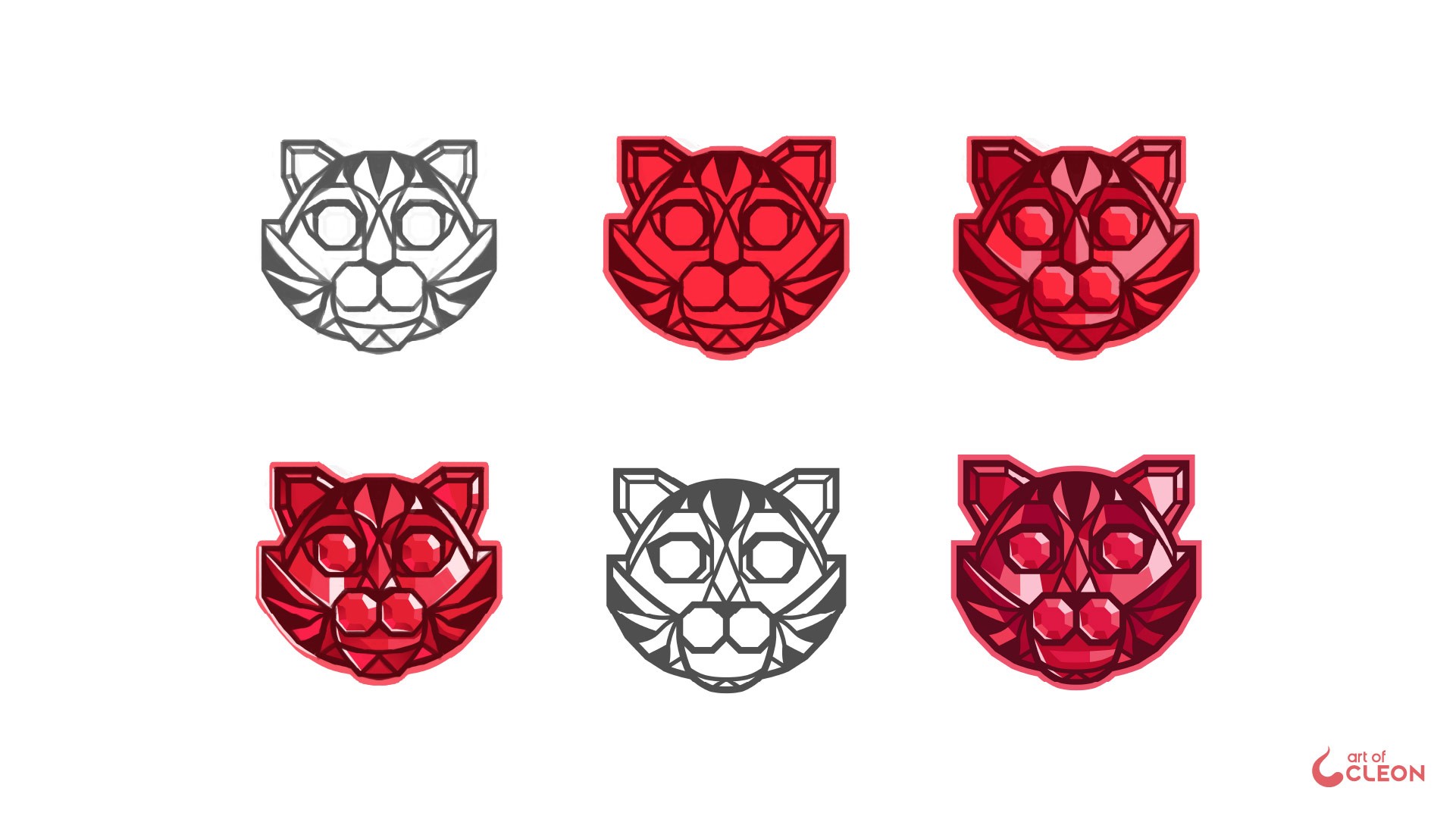
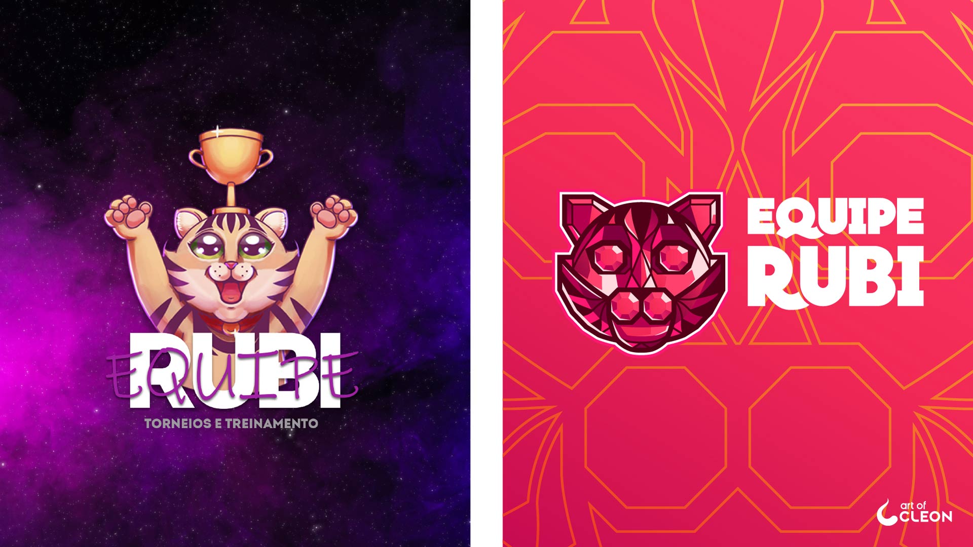
Simplification kept the original subject recognizable at smaller sizes.
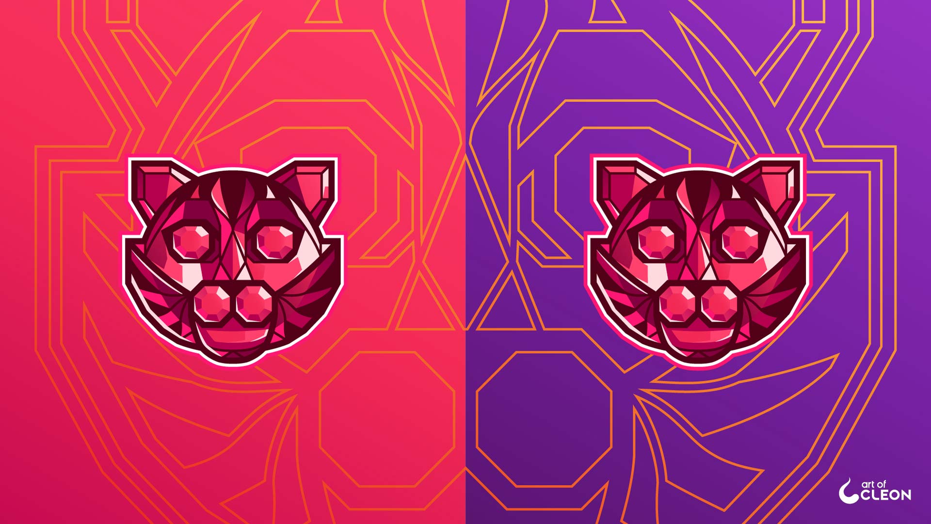
Three Color Families, Three Different Roles
The palette was built with a clear hierarchy. Ruby leads the identity, Cosmos supports it and Gold is reserved for details and linework. Gold never becomes the main field.
Within each family, the symbol uses outline, shadow, base color, dark and light midtones, surface subdivision and specular highlight to model depth across its facets.
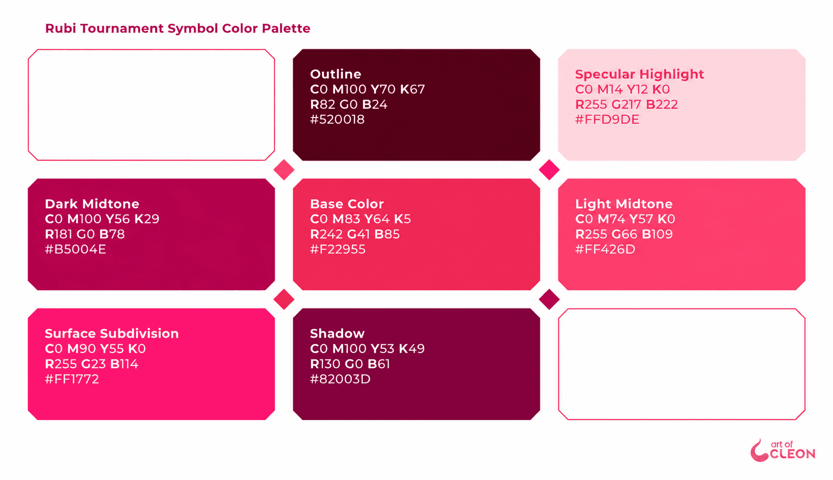
The palette behaves like a shader for the ruby material, assigning a specific role to each tone across the faceted surface.
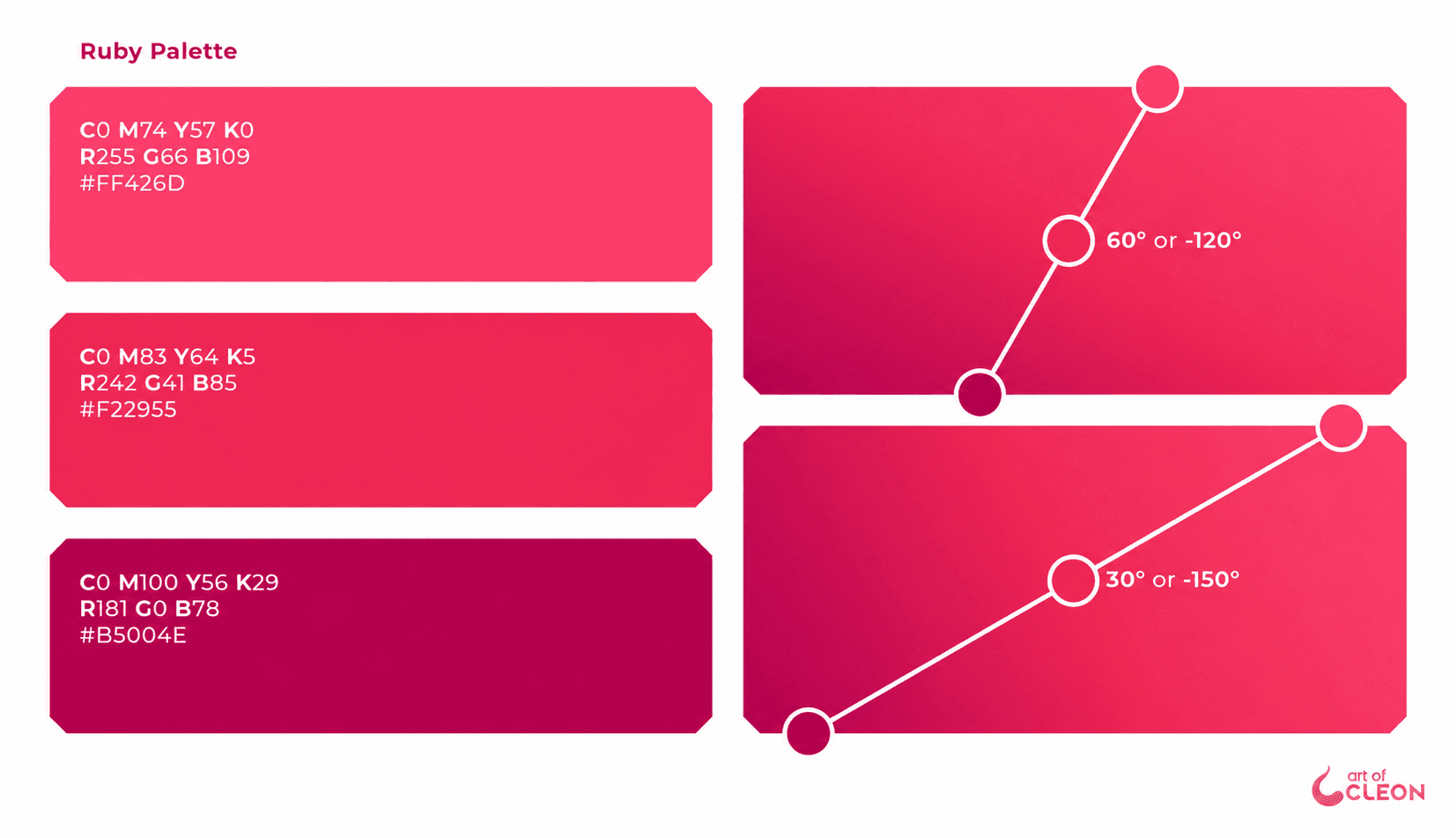
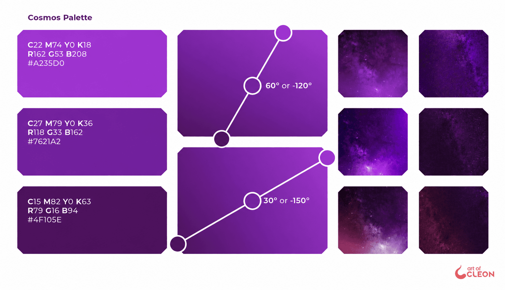
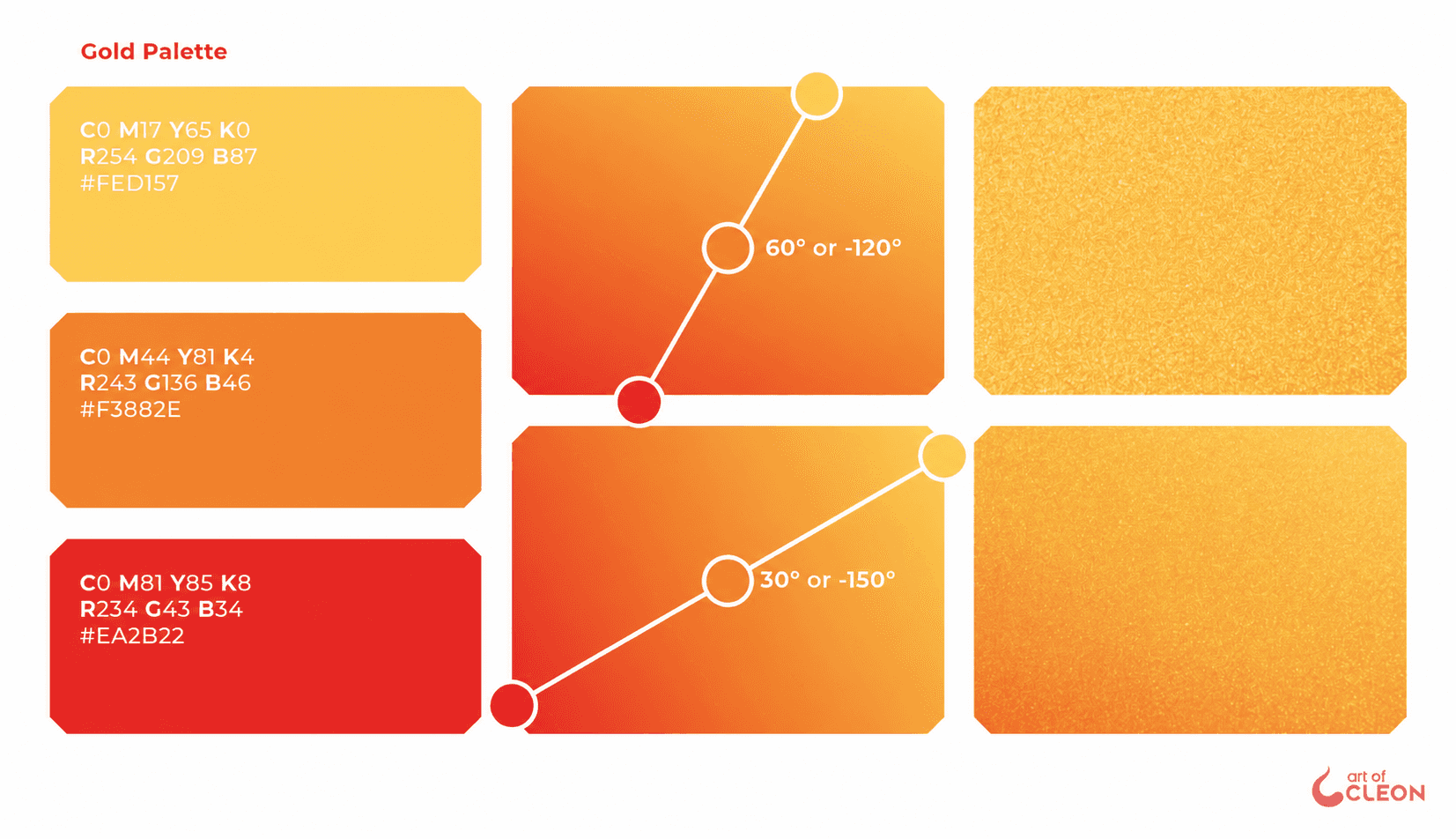
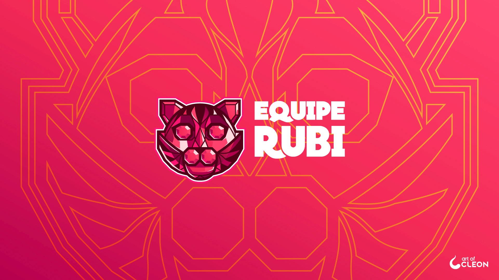
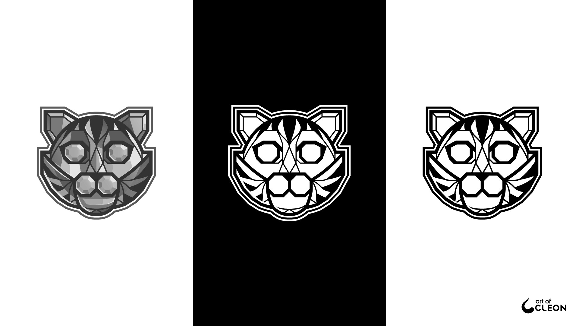
The applications preserve the same hierarchy across color, line and monochrome versions.
The Gem Becomes the Cat
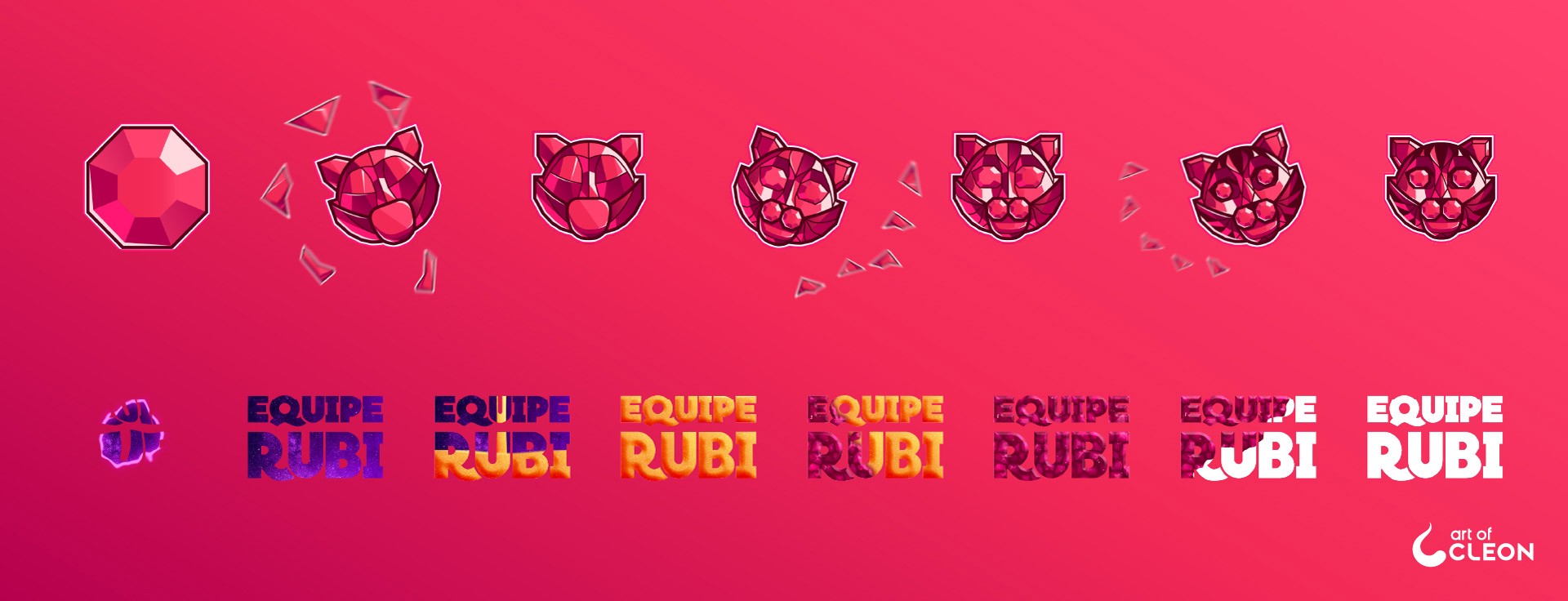
The motion piece begins with a ruby, breaks its surface into moving facets and uses those fragments to reveal the cat. Working with Nathalia’s lettering, a second sequence carries the same faceted language into the wordmark. The finished animation introduced the transition on social media and within the brand presentation.
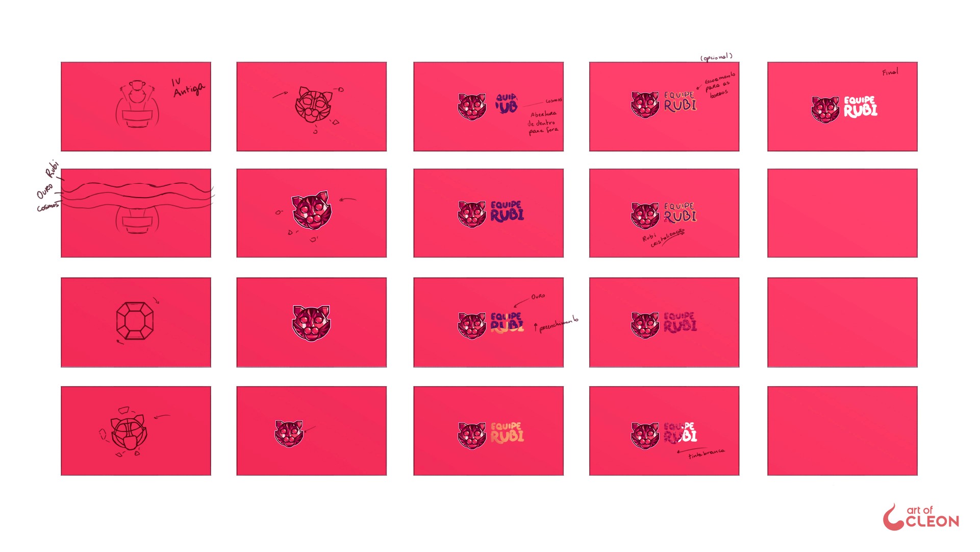
The storyboard separates the ruby, cat and lettering transitions before timing and easing bring them into one sequence.
A Face Built to Be Posed
The cat was rigged as a set of independent controls for the ears, eyelids, irises, eyes, face, jaw, cheeks and smile. Each control could change the expression without breaking the faceted construction.
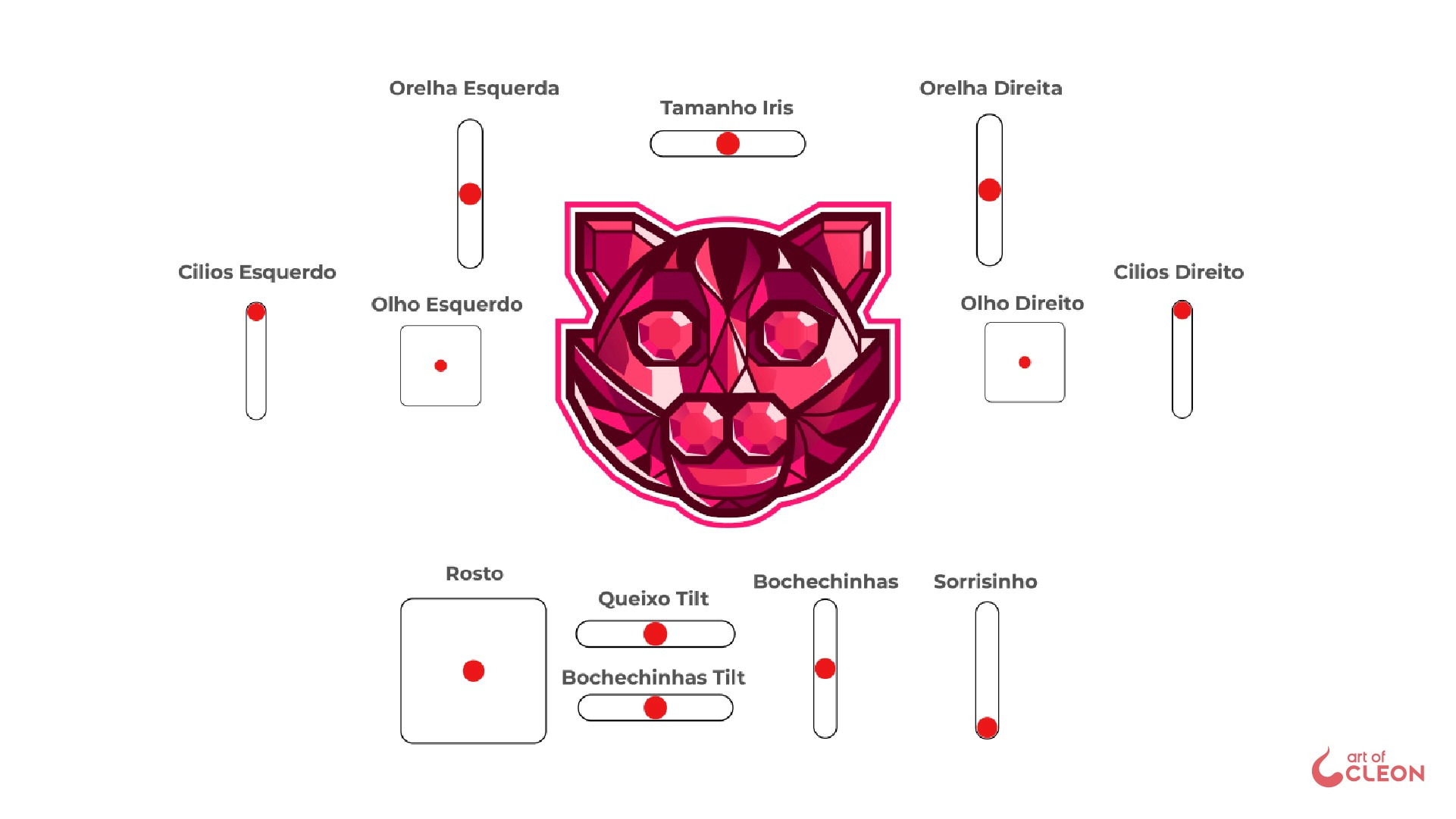
Four synchronized poses show how the same rig supports distinct expressions while the symbol remains recognizable.
From Separate Studies to One Reveal
The symbol and lettering were animated as separate studies on white before being combined with the color system and supporting transitions. I could then refine each entrance before judging the identity as one complete motion piece.
The white-background study isolates the transformation of the symbol and the movement of the lettering.
The final transition brings the ruby, cat, lettering and color hierarchy into one presentation.